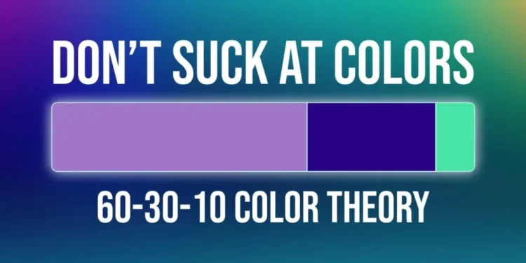
In the realm of mobile UI design, crafting a visually appealing interface that exudes maturity and seamlessness is paramount. One effective guideline to achieve this is the 60-30-10 color rule. In this article, we’ll delve into how this rule can be employed to create sophisticated, well-thought-out, and non-distracting color schemes for your mobile UI design projects.
Table of Contents
Read more related topics
7 WordPress SEO Plugins to Elevate Your Website’s Search Prowess in 2023
Extend WooCommerce Order Statuses with Custom Labels Now – 2023 Guide
SEOPress: Simplify Your SEO and Tap into the Power of AI in 2023
Introduction
Before we delve into the intricacies of the 60-30-10 color rule, it’s essential to understand its significance in mobile UI design. This rule provides a framework for allocating percentages of color within your design, ensuring a harmonious and balanced visual experience. Let’s explore this rule using practical examples and applications.
Understanding the 60-30-10 Color Rule

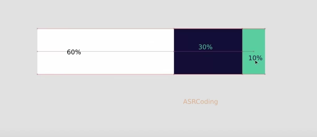
The 60-30-10 color rule divides your color palette into three segments:
- 60% Neutral/Base Color:
- Represents the primary background or dominant color.
- Typically a neutral or subdued color, like cream, white, or a dark shade for dark interfaces.
- 30% Primary Color:
- Signifies a color that is important but not as prominent as the neutral/base color.
- Often a brand color or a significant thematic color.
- 10% Call-to-Action Color:
- Reserved for vibrant, attention-grabbing hues.
- Used sparingly in crucial areas to prompt user interaction.
Practical Application

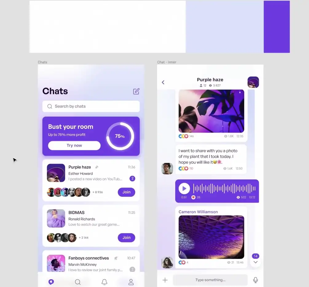
Let’s illustrate the 60-30-10 rule with a sample color palette:
- 60% Neutral Color:
- Utilize a neutral shade for the majority of the interface. For example, a creamy white or a dark background for a dark-themed app.
- 30% Primary Color:
- Introduce a primary color, possibly a brand-specific hue, to emphasize important elements.
- 10% Call-to-Action Color:
- Reserve a vibrant color for call-to-action buttons, ensuring they stand out and invite user engagement.
By adhering to this rule, your color palette achieves a cohesive and visually pleasing balance.
Real-world Examples

Let’s explore some real-world implementations of the 60-30-10 rule:
- Gradient Play:
- Some designers incorporate gradients while still maintaining the 60-30-10 principle. This adds a touch of creativity without deviating from the rule’s essence.
- Dark Interfaces:
- Even in dark-themed designs, the 60-30-10 rule remains applicable. Dark primary colors, lighter secondary colors, and vivid accents create a visually appealing UI.
- Color Flips:
- Designers might experiment with flipping the color ratios, such as having a bright color as 60%, showcasing the flexibility of the rule.
Conclusion
Mastering the 60-30-10 color rule empowers designers to create visually stunning and user-friendly mobile interfaces. By strategically allocating colors, maintaining balance, and embracing creativity within this framework, your UI designs can achieve a mature and seamless aesthetic.
Let’s Connect Now
Connect with us on Facebook, Instagram, Telegram or Pinterest for more design insights and subscribe to our newsletter for the latest updates delivered to your inbox.
FAQs: Related to Mastering UI Design
Is it necessary to strictly adhere to the 60-30-10 rule?
While the 60-30-10 rule offers a structured approach, it’s essential to view it as a guideline rather than a strict rule. Creativity often involves bending the rules to suit specific design needs.
Can the 60-30-10 rule be applied to dark-themed interfaces?
Absolutely. In dark-themed designs, adapt the neutral color to a dark shade, and maintain the 60-30-10 distribution for a visually appealing interface.
How can I implement the 60-30-10 rule in a two-color design?
In a two-color design, allocate 60% to the primary color and 40% to the secondary color. While deviating slightly, this approach maintains a balanced visual hierarchy.
Can the 60-30-10 rule be used for web design?
Yes, the 60-30-10 rule is versatile and applicable to web design, ensuring a harmonious color distribution across various platforms.
What are some tools to assist in implementing the 60-30-10 rule?
Design tools like Figma and Adobe XD provide features to organize and visualize color palettes, aiding designers in implementing the 60-30-10 rule effectively.


