Minimalist web design (Use the 60 30 10 Color Rule) is a style that emphasizes simplicity, clarity, and functionality. It aims to reduce visual clutter and enhance user experience by using only the essential elements and content. One of the key aspects of minimalist web design is color choice, which can have a significant impact on the mood, tone, and message of your website.
Table of Contents
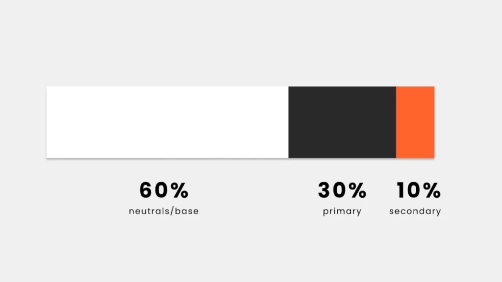
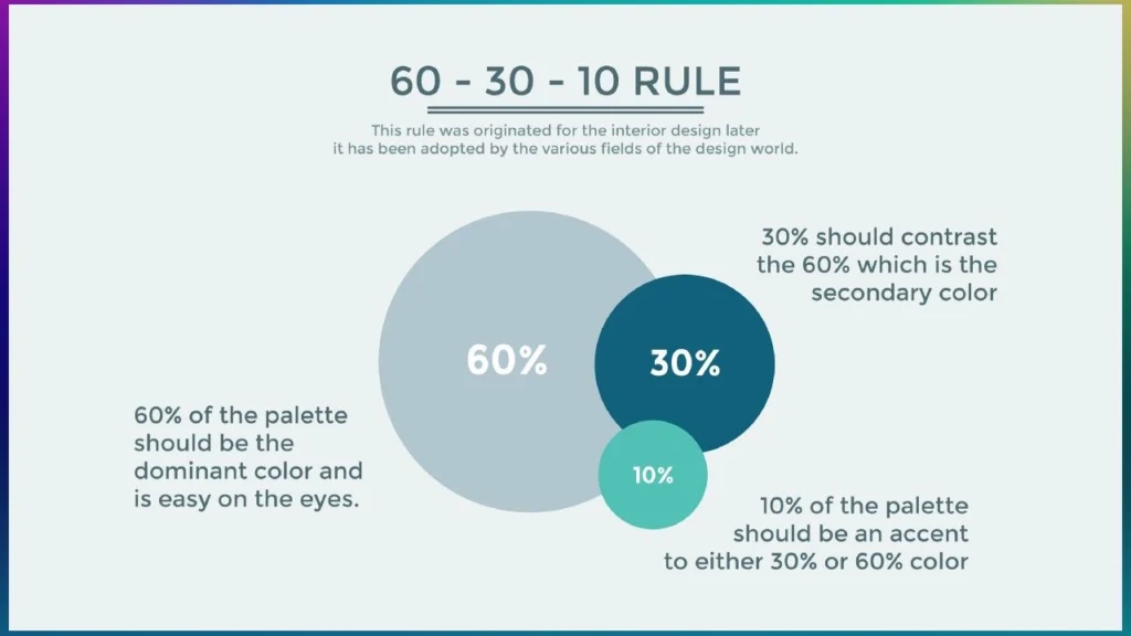
One of the most popular and effective methods to choose colors for a minimalist web design is the 60 30 10 color rule. This rule states that you should use three colors in your design, with one dominant color taking up 60% of the space, one secondary color taking up 30%, and one accent color taking up 10%. This way, you can create a balanced and harmonious color scheme that is pleasing to the eye and easy to navigate.
5 Must-Have WordPress Tools for 2024: Boost Your Content, SEO, and Security
RankMath vs Yoast SEO: Which is Better for SEO in 2023?
How to apply the 60 30 10 color rule

To apply the 60 30 10 color rule, you need to follow these steps:
Choose your colors: You can use a color wheel, a color palette generator, or your own intuition to pick three colors that work well together. You can also use color psychology to select colors that match the purpose and emotion of your website. For example, blue is often associated with trust, calmness, and professionalism, while red is often associated with excitement, passion, and urgency.
Assign your colors: Once you have your three colors, you need to decide which one will be your dominant color, which one will be your secondary color, and which one will be your accent color. Your dominant color should be the one that reflects the main theme or idea of your website, and it should be used for the background, large areas, and main elements. Your secondary color should be the one that complements your dominant color, and it should be used for smaller areas, subheadings, and secondary elements. Your accent color should be the one that contrasts with your dominant and secondary colors, and it should be used for buttons, links, icons, and other details that you want to highlight.
Apply your colors: After you have assigned your colors, you need to apply them to your web design. You can use a tool like Photoshop, Sketch, or Figma to create a mockup of your website and see how your colors look together. You can also use a tool like CSS to code your website and adjust your colors as needed. You should aim to follow the 60 30 10 ratio as closely as possible, but you can also tweak it slightly to suit your preferences and needs.
Examples of minimalist web design using the 60 30 10 color rule

Here are some examples of minimalist web design using the 60 30 10 color rule:
Mastering AI Tools: Best Beginner to Pro Guide in 2024
Mastering Samsung Phone Repairs: 5 Crucial Insights for DIY Enthusiasts
Apple: Apple uses a white dominant color, a black secondary color, and a blue accent color to create a clean, sleek, and elegant web design. The white background creates a spacious and airy feel, the black text and images provide contrast and clarity, and the blue buttons and links add a touch of color and interest.
Spotify: Spotify uses a black dominant color, a green secondary color, and a white accent color to create a dark, modern, and dynamic web design. The black background creates a dramatic and immersive feel, the green text and images provide brightness and energy, and the white buttons and icons add a crisp and minimalist touch.
Airbnb: Airbnb uses a white dominant color, a pink secondary color, and a gray accent color to create a simple, friendly, and inviting web design. The white background creates a light and fresh feel, the pink text and images provide warmth and personality, and the gray buttons and details add a subtle and sophisticated touch.
FAQ and answers
Here are some frequently asked questions and answers about the 60 30 10 color rule and minimalist web design:
Why is color important for minimalist web design?
Color is important for minimalist web design because it can help you create a visual hierarchy, convey a mood and message, and guide the user’s attention and action. Color can also help you differentiate your website from others and create a unique and memorable brand identity.
How do I choose the right colors for my website?
There is no definitive answer to this question, as different colors can have different effects and meanings depending on the context and audience. However, some general tips to choose the right colors for your website are:u003cbru003eu003cstrongu003eu002du002du003eu003c/strongu003eUse colors that match the purpose and emotion of your website. For example, if your website is about health and wellness, you might want to use colors that evoke calmness, nature, and positivity, such as green, blue, and yellow.u003cbru003eu003cstrongu003eu002du002du003eu003c/strongu003eUse colors that are appropriate for your industry and target market. For example, if your website is about finance and business, you might want to use colors that convey trust, professionalism, and reliability, such as blue, gray, and black.u003cbru003eu003cstrongu003eu002du002du003eu003c/strongu003eUse colors that are consistent with your brand identity and personality. For example, if your website is about fashion and creativity, you might want to use colors that reflect your style, taste, and originality, such as purple, pink, and orange.
What are some common mistakes to avoid when using the 60 30 10 color rule?
Some common mistakes to avoid when using the 60 30 10 color rule are:u003cbru003eu003cstrongu003eu002du002du003eu003c/strongu003eUsing too many colors or too few colors. Using too many colors can make your web design look chaotic, confusing, and unprofessional, while using too few colors can make your web design look boring, dull, and uninspiring. You should stick to three colors, or at most four, to create a balanced and harmonious color scheme.u003cbru003eu003cstrongu003eu002du002du003eu003c/strongu003eUsing colors that clash or blend. Using colors that clash can make your web design look harsh, unpleasant, and unappealing, while using colors that blend can make your web design look flat, bland, and indistinguishable. You should use colors that complement and contrast each other, and use tools like color theory, color harmony, and color temperature to help you choose the right colors.u003cbru003eu003cstrongu003eu002du002du003eu003c/strongu003eUsing colors that are too bright or too dark. Using colors that are too bright can make your web design look overwhelming, distracting, and irritating, while using colors that are too dark can make your web design look gloomy, depressing, and intimidating. You should use colors that are moderate and comfortable for the eye, and use tools like color value, color saturation, and color brightness to help you adjust the colors.


