Creating responsive layouts has never been easier, especially when leveraging the power of Flexbox layouts in Bricks Builder. In this guide, we’ll walk you through the process of setting up a fully responsive Flexbox layout without the need for breakpoints. Whether you’re a beginner or an experienced designer, these techniques will streamline your workflow and enhance your web design skills.
Table of Contents
Read related articles
Embed YouTube Channel on Your WordPress Website Using Smash Balloon YouTube Plugin
How to Translate Your YouTube Videos with AI (Rask.ai Tutorial): 2023 Step-by-Step Guide


SEO Mastery: 10 Essential WordPress SEO Plugins for Website Optimization in 2023
1. Understanding Flexbox Basics:
Before diving into the details, let’s grasp the fundamentals of Flexbox. Flexbox, or the Flexible Box Layout, simplifies the creation of responsive structures without relying on traditional methods like floating or positioning.
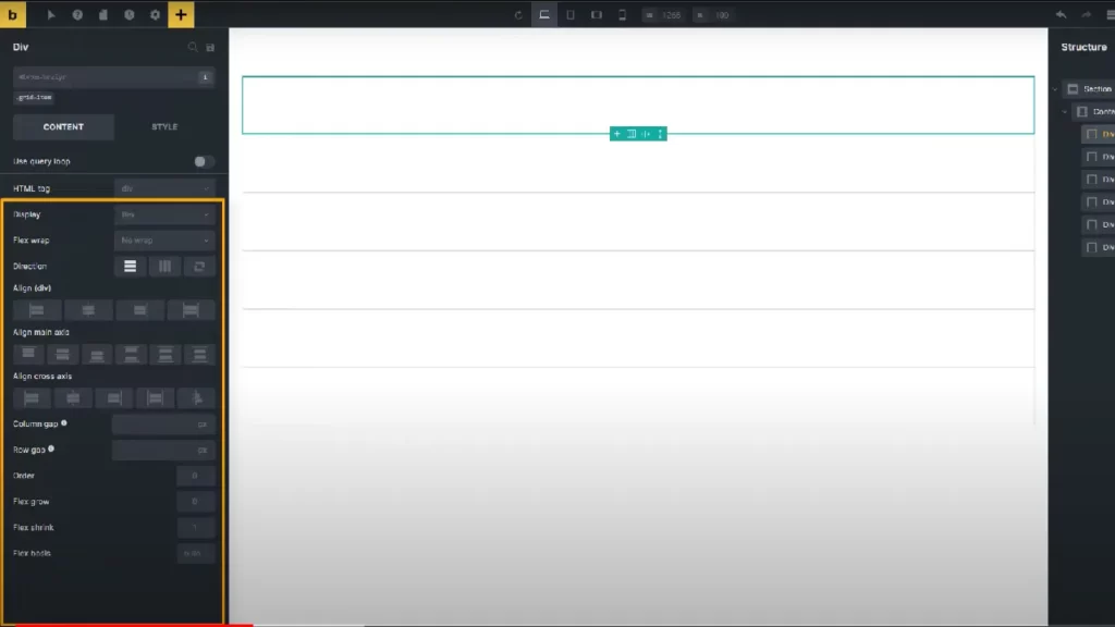
2. Setting Up a Flex Container:
In Bricks Builder, a Flexbox layout begins with a section element. Learn how to define the outer and inner containers and understand their roles in containing and restricting the website’s content.
3. Styling Flex Items:
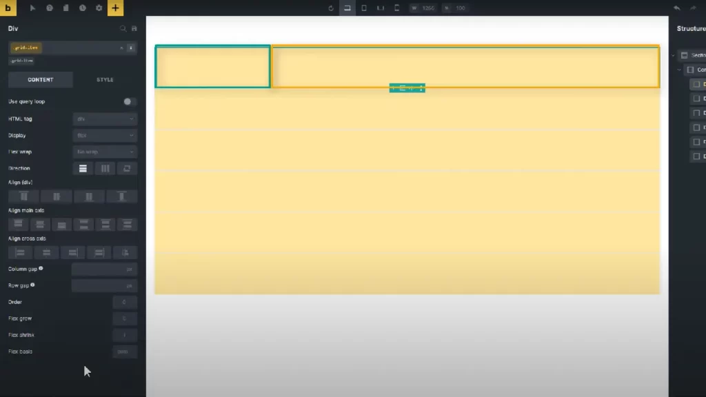
Explore the essential properties of flex items, including order, flex grow, flex shrink, flex bases, and self-align. These properties play a crucial role in determining the size and behavior of each item within the Flexbox layout.
4. Creating a Multi-Column Layout:
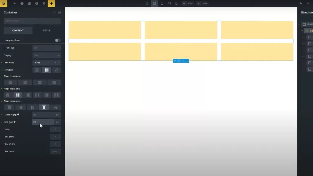
Discover the steps to achieve a multi-column layout with ease. Set the flex grow, flex shrink, and flex bases to create a visually appealing and functional design.
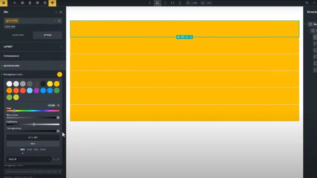
5. Introducing Gaps Between Flex Items:
Learn how to add spacing between flex items using the column and row gap properties. Understand the impact of these gaps on the overall layout and adapt them to your design needs.
6. Achieving a Responsive Design:
Unlock the magic of automatic responsiveness without the need for breakpoints. Explore the combination of flex bases, flex grow, and flex shrink properties to let the Flexbox engine handle the calculations seamlessly.
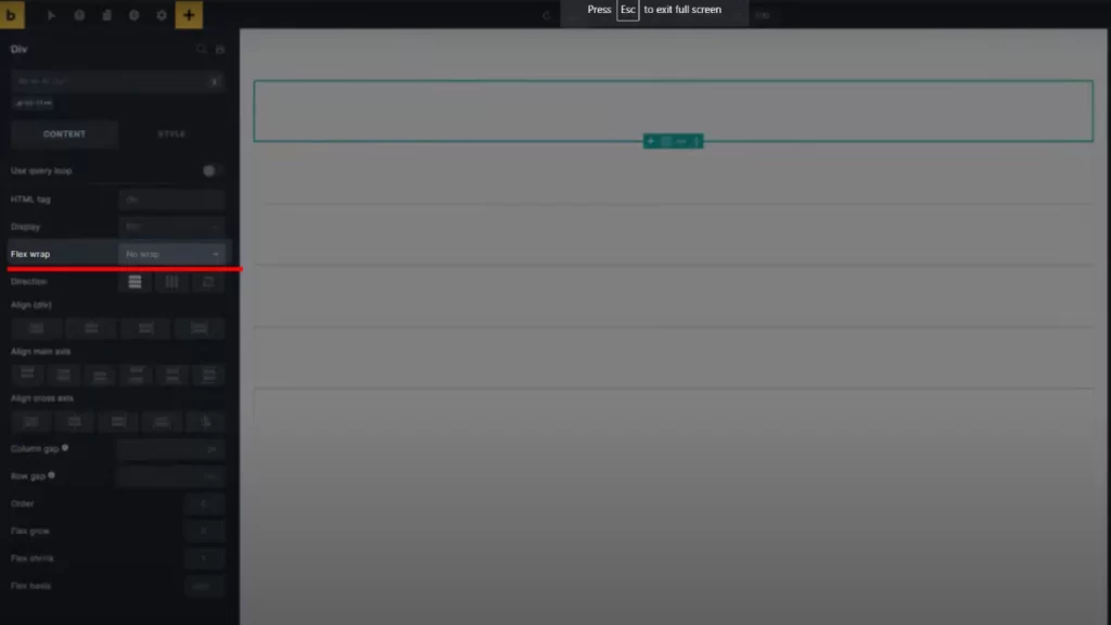
6.1. Flex Bases and Minimum Width:
Understand the significance of setting flex bases in percentages and learn how to determine the minimum width of flex items using the minimum width property in layout settings.
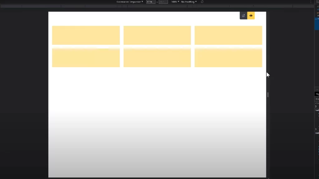
7. Previewing and Testing Responsiveness:
Ensure your design adapts flawlessly to various screen sizes by previewing and testing responsiveness. Witness the Flexbox layout adjust dynamically as you resize the screen.
8. Optimizing for SEO-Friendly Layouts:
Implement best practices for creating SEO-friendly layouts. Enhance your website’s visibility by optimizing the structure and content for search engines.
Conclusion:
Mastering Flexbox layouts in Bricks Builder opens a world of possibilities for creating responsive and visually appealing designs. With the techniques learned in this guide, you can streamline your workflow and achieve consistent layouts across multiple breakpoints.
Connect with us:
Connect with us on various social media platforms – Telegram, Facebook, Instagram, Pinterest, etc. – for more web design tips and updates. Subscribe to our newsletter for exclusive content delivered straight to your inbox.
FAQs: Flexbox layouts in Bricks Builder
Q1: What is Flexbox, and why is it beneficial in web design?
Flexbox, or Flexible Box Layout, is a CSS3 layout model that simplifies the creation of responsive and complex web layouts. It offers a more efficient way to distribute space among items in a container, making designs more adaptable and dynamic.
Q2: Can I use Flexbox in other website builders, or is it specific to Bricks Builder?
Flexbox is a CSS feature and can be used in various website builders and frameworks. The specific implementation may vary slightly, but the core principles remain the same.
Q3: How does the combination of flex bases, flex grow, and flex shrink create automatic responsiveness?
Flex bases set a minimum width, flex grow allows items to expand, and flex shrink prevents items from shrinking below the defined minimum width. This combination enables the Flexbox engine to automatically adjust the layout based on available space.
Q4: Why is it essential to set flex bases in percentages rather than pixels for responsiveness?
Using percentages for flex bases ensures flexibility and responsiveness across different screen sizes. It allows the layout to adapt proportionally, providing a more seamless and consistent user experience.
Q5: What is the recommended approach for optimizing Flexbox layouts for search engines?
To optimize Flexbox layouts for search engines, focus on creating clean and semantic HTML structure, use descriptive and relevant content, and ensure a logical flow of information. Additionally, implement appropriate meta tags and alt attributes for images.


